we are the blues ‘22
/ visual identity
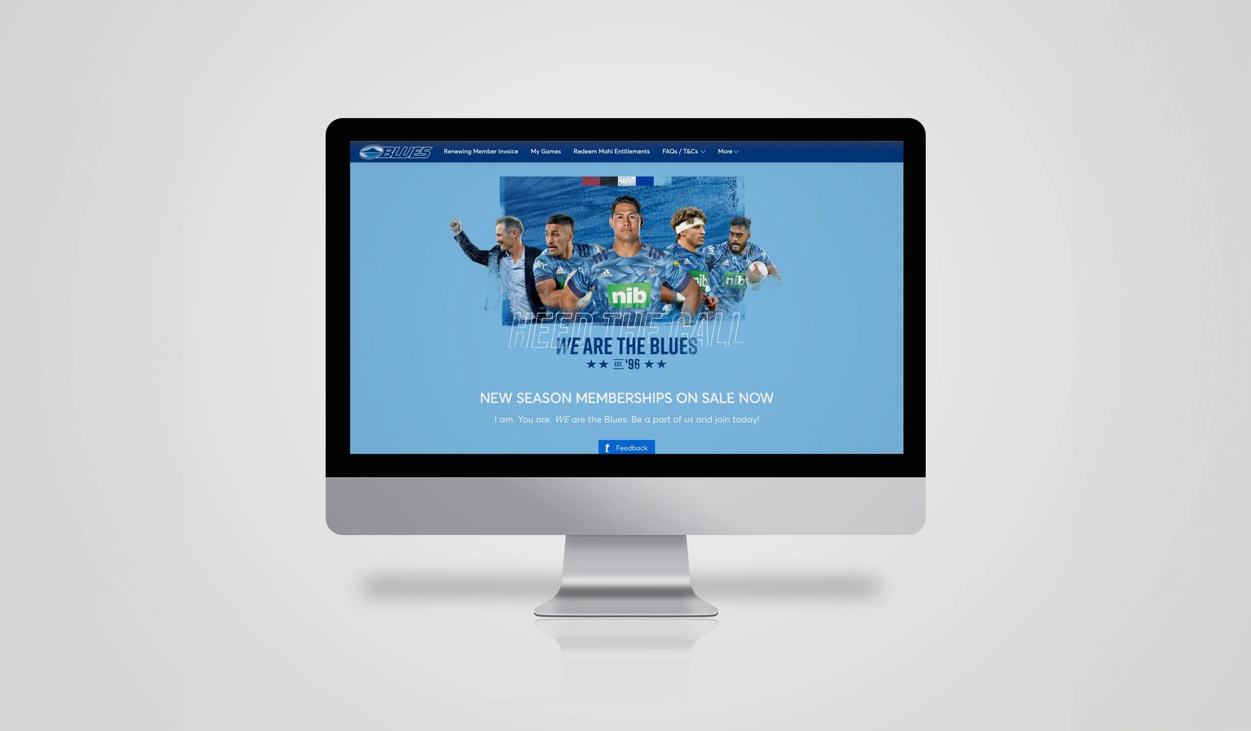
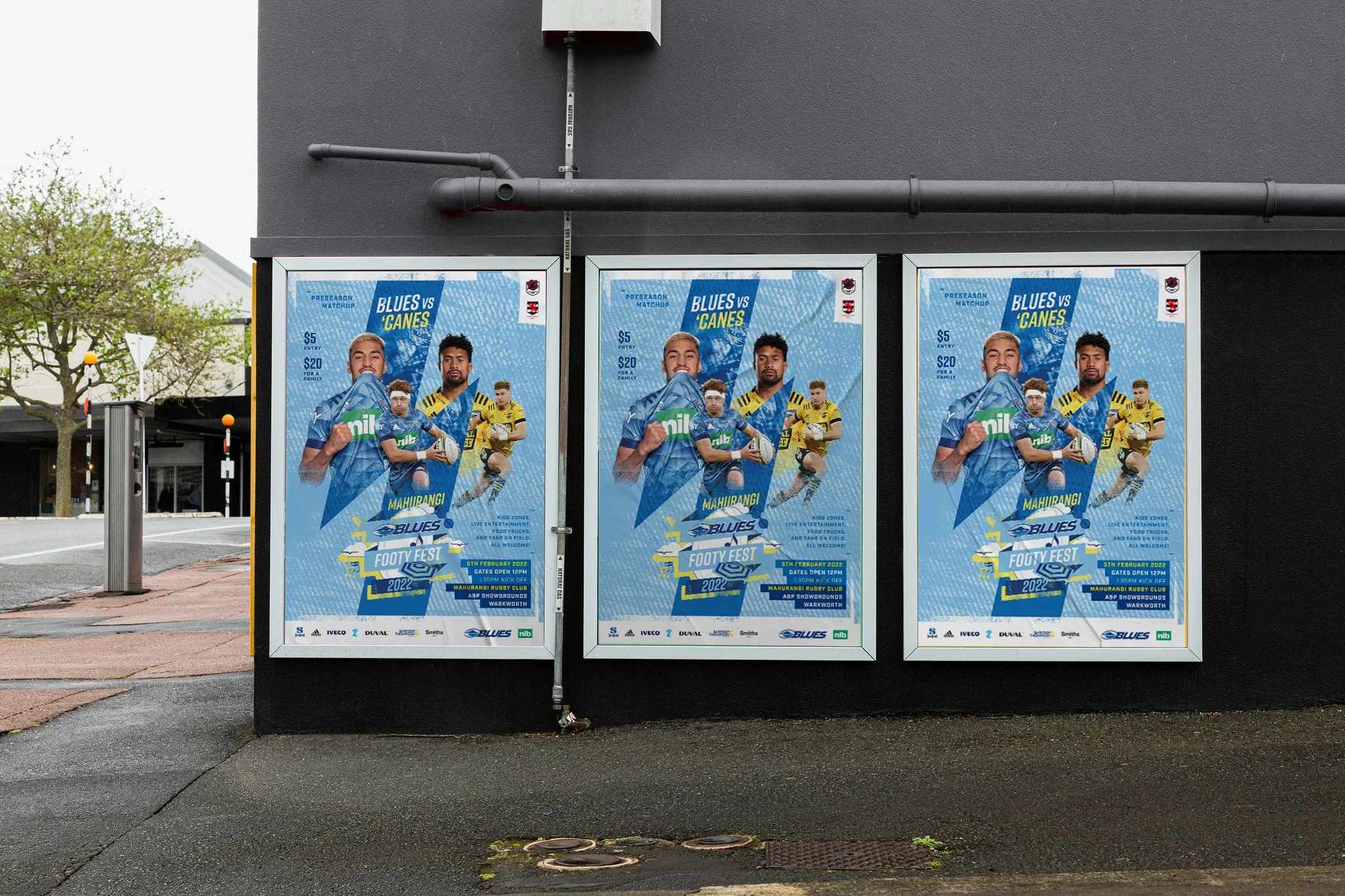
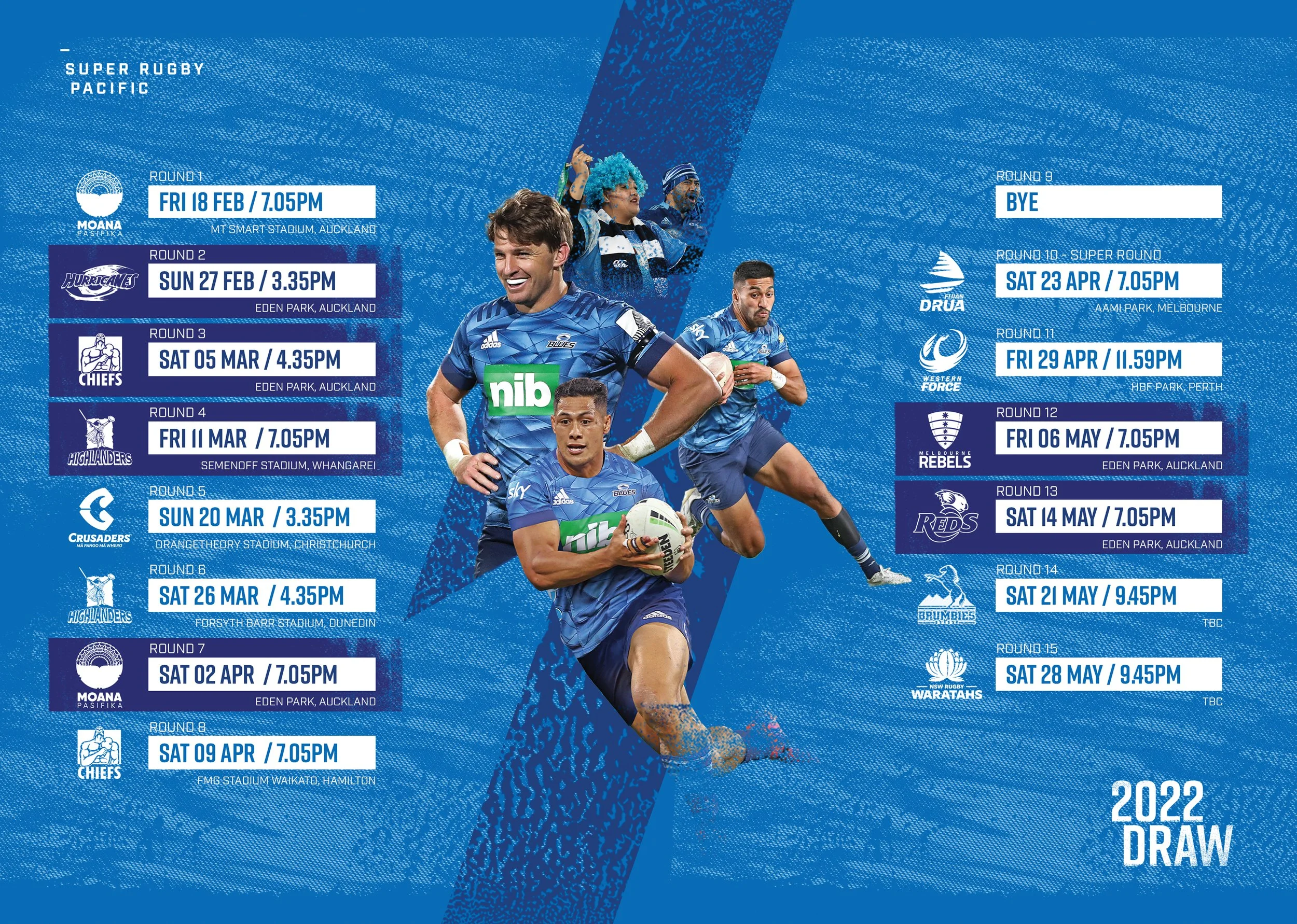
I developed “We are the Blues” through the 2022 campaign - it had resonated the previous year and it was decided for it to be part of our brand identity moving forward. We had just come off winning Super Rugby Trans Tasman the year before, so I created a lock up based on 4 stars and an “Est. ‘96” lock-up and introduced colour bars representing the Provincial Unions that the Blues represent - Northland, Auckland and North Harbour. I also introduced a water pattern that mirrors the pattern on the playing jersey, and which is an important element to our geographic location. And one more element that would be introduced is a stylised cityscape that includes Auckland, Harbour and Cape Reinga as a further visual reference to our region as a whole. The painting marks were replaced by a more print texture style. These elements were very well received, and have become hardwired into the Blues extended brand identity.


